iOS Simulator
Overview
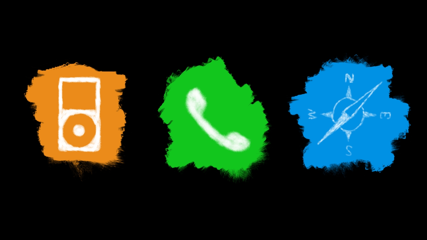
Being inspired by how much iOS has changed over the years, I took a look that's all so familiar and made it different in this Playground.


Featuring over 200 self-drawn doodles, an astounding number of mini apps (2), and a very familiar feel, I hope to inspire people to express their creativity through seeing things differently.
Multiple icon styles combined into a singular iterating icon shows (subtle) interactivity.
But some don't need to iterate over and over again. Animations are crucial to give users feedback, and in most cases, they are not supposed to be interactable.
The Playground covers a lot of these thoughts, which are all covered in the videos embedded below. It goes over why the doodles were used, what feedback and consistency meant, and more.
Results
Development took about 9 days. I was, at that time, pretty new to Swift and development for iOS. I felt crazy halfway through development thinking I even stood a chance.
Fun fact though, sometimes the Playground would sort of run, especially when it's right after the first compile, leading to the interface not responding to anything. So that was kind of where my anxiety began.


