
Re
May 30 2023
Oh look, candy!
If you had the chance to visit my previous website, you'd know it's based on a completed template. While it was pretty good for what I needed, I felt it lacked a few minor details that would make browsing it a better experience. So, with my lack of web development experience, I went on an adventure with my trusty laptop.
To give you some context as to what I'm gonna talk about in a bit, I'm gonna take one singular sentence from my first ever blog post, and I quote: "I thought web development was cool, and I kinda wanted to get into it? Fast forward a couple of years, you can forget what I said earlier."
Well, the reason why I ultimately decided against learning web was because in order to implement something minimal, I had to exert maximum effort. And energy. And time.
What brought me back here, you might ask? I'll give you 2 reasons.
Don't get me wrong, I liked the boldness of some of the elements, and of course, the parallax effect while you scroll through the portfolio items. The thing is, the site looked way too artificial to me. It didn't express me. And to make adjustments to do just that? Ain't happenin' Chief. Which leads me to my 2nd point.
I had this brilliant idea to have custom effects around portfolio pages, especially ones that are available commercially. They would have custom-themed pages with the design flavour of the project's theme. I ended up wanting to just redesign the whole site.
Do you see the problem here? Yeah, I don't know how to do web.
I had this insane motivation to learn, so I asked around for the best frameworks to learn. I ended up with ReactJS, to which I did actually take my time to learn.
Fast-forward a few weeks, I ended up trying out NextJS, as it had native support for MDX files. This is the kind of file (or extension rather) that the template I used used for blog and portfolio posts, rendering migration easier for me.
Fortunately for me, the whole process wasn't that bad. I'm sure I have a few instances of spaghetti code but what runs, runs, right? Wouldn't put up web development on my resumé, but as far as a public release of a work-in-progress goes, I'd say it's an immense upgrade. Not to mention, I had so much fun learning the frameworks as I go, I don't regret giving it another try at all.
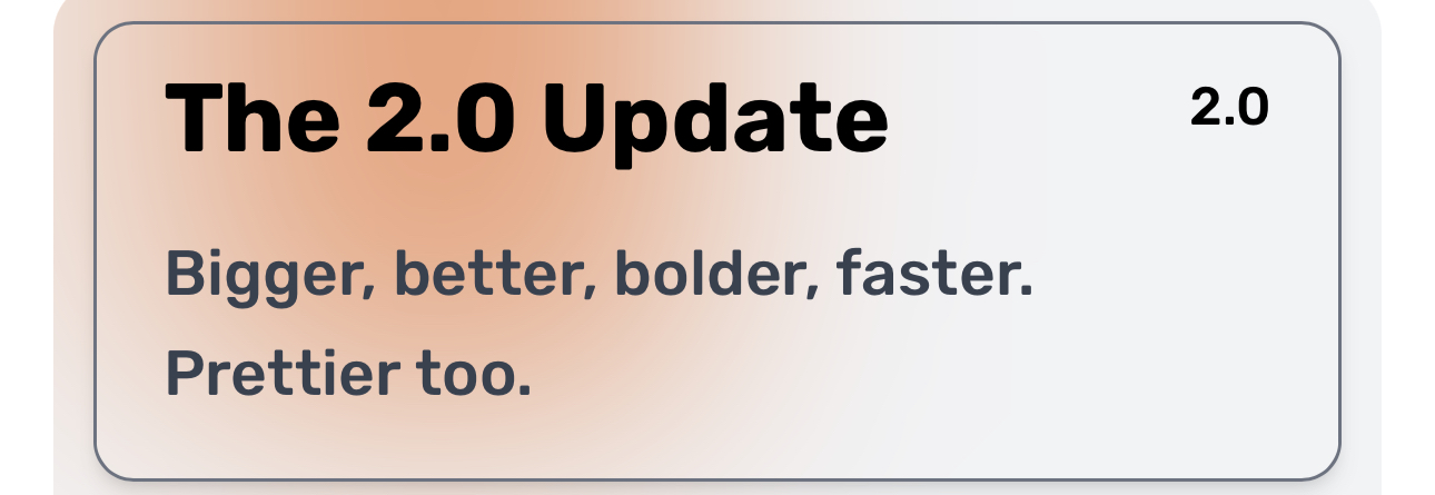
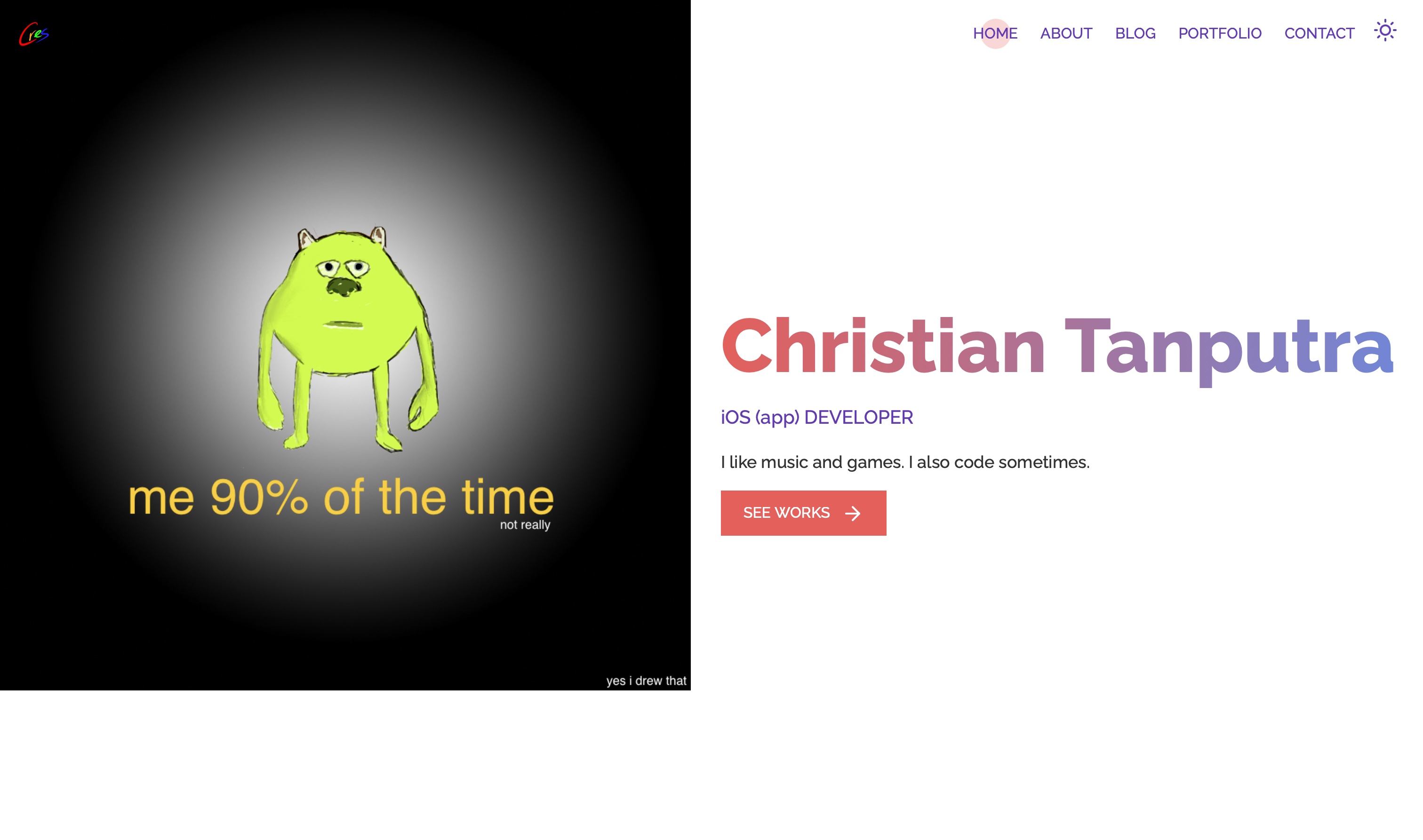
Introducing cres by Christian Tanputra (that's me!). From this point onwards, all commercially available apps released by yours truly will now be released under this brand.
There's so much newness I've implemented here, and I'd like to talk about the changes and decisions behind close to every design choices.
I've designed mobile apps of my own, some you might have seen, and others that will never see the light of day. While building this website, I found out, as it turns out, that interactions on web are a lot different than those on apps; who would've thought!
The mouse cursor has been with me for basically my entire life. I've had computer classes back in primary school, had a GAMING (not really) computer at home when I was 9, and had to use a lappy ever since, idk, university? The point here being I know how interactions are designed with a cursor in mind, just a little bit.
Without further ado, let's talk about hovering.
Giving clues as to what's pressable and what's not isn't always easy. Some, like mobile apps, do it by designing the the very button they see, as buttons. Others, like websites, do it in a highlighting way; some through showing underlines and changing of colours, some through a combination of animation. This, however, does not dismiss the fact that they're all designed very intentionally, conjuring what designers think feels the most natural and tangible in a software environment.
(Text here talking about how it's not gonna be any different but I did it my way.) [SHUDDERS]
Everything*, and I mean everything**, on this website that's interactable, has an animation to it. Whether it's the increase in size, the changing of one's colour, or just a basic 0.1 sec flash, you'd be hard pressed to find an interactive button that shows no emotions.
What's on the menu for mobile users that don't have access to hovers? Well, they're not getting the same treatment, but they're getting dessert.
The same buttons are now distinctly highlighted, enabling a mobile app-like experience. This is also further complemented by the style of some of the buttons.
I remember wanting to use a GIF image to explain Math Galactica's zoom-in animation in a blog, and giving up after trying for a bit. While that wasn't the breaking point for me, I held on to that feeling, wondering when I'll get to dynamically showcase different things. Forgive, but don't forget.

It doesn't have to end here. If the interwebs has it developed, I can probably have it integrated. It's dynamic, after all.
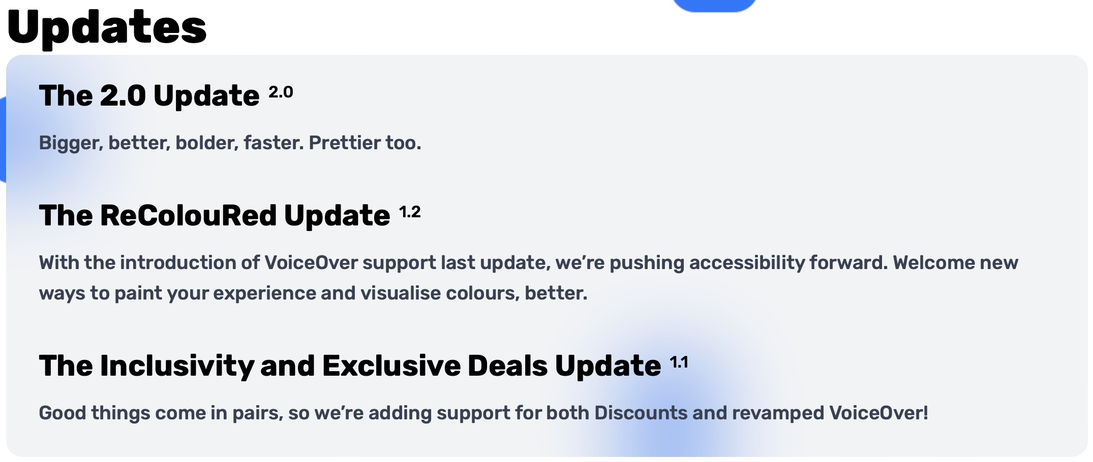
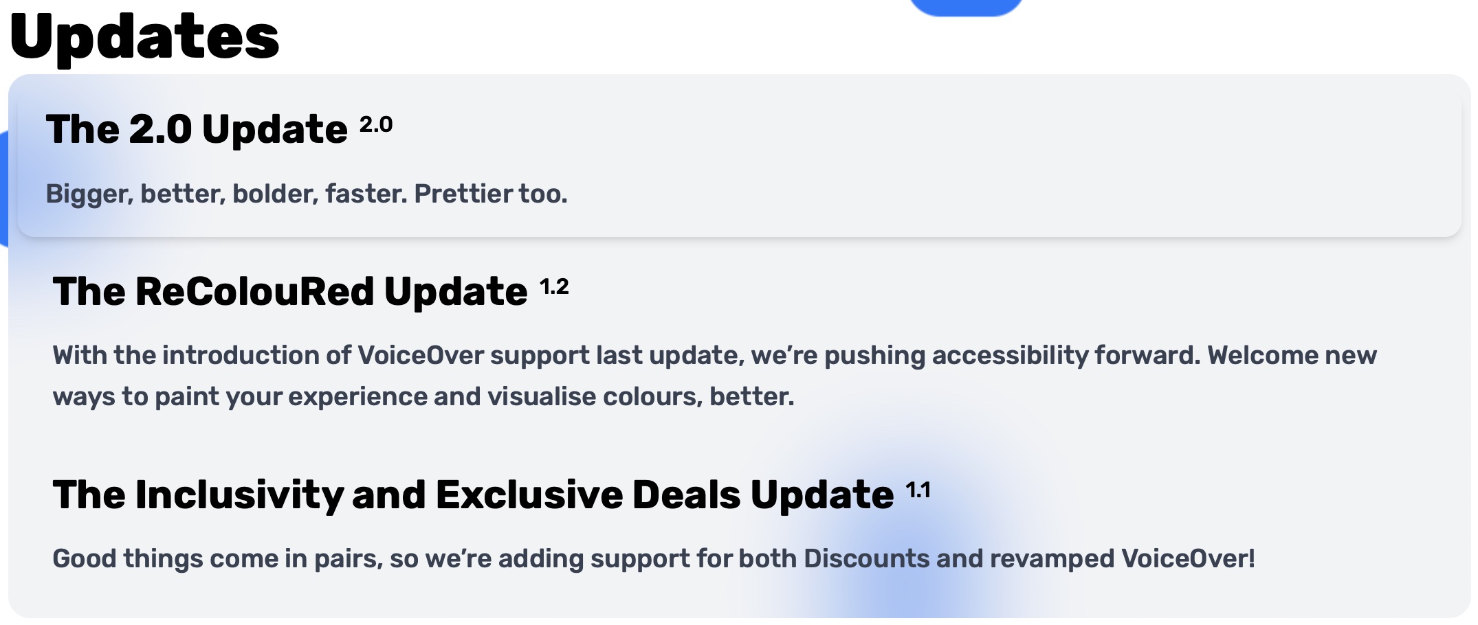
I'd say something cheesy here, but I don't want to stretch this blog thin. In this part, however, I'll be covering a lot of what you can see, so buckle up.

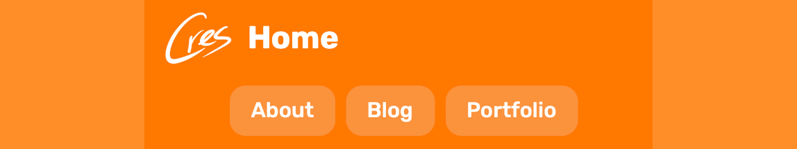
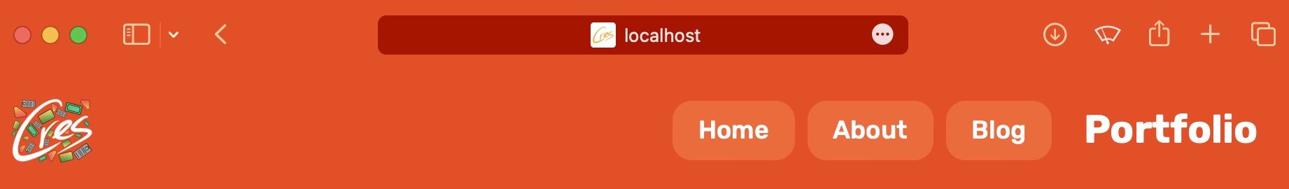
Bold and enlarged words on the navigation bar lets you know where you are wherever you are. And on mobile, it's clearer than ever. The back button is enabled separately.
And on Safari, your toolbar/tab bar/address bar bar matches seemlessly with the colour of the navigation bar.
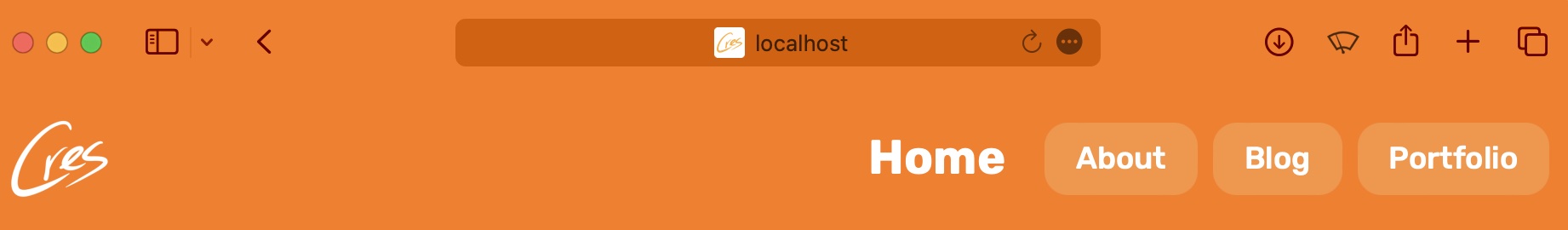
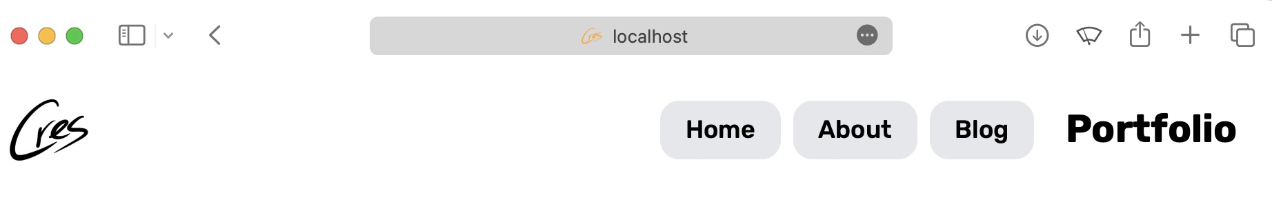
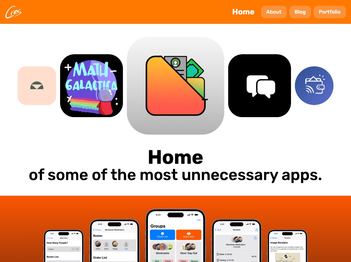
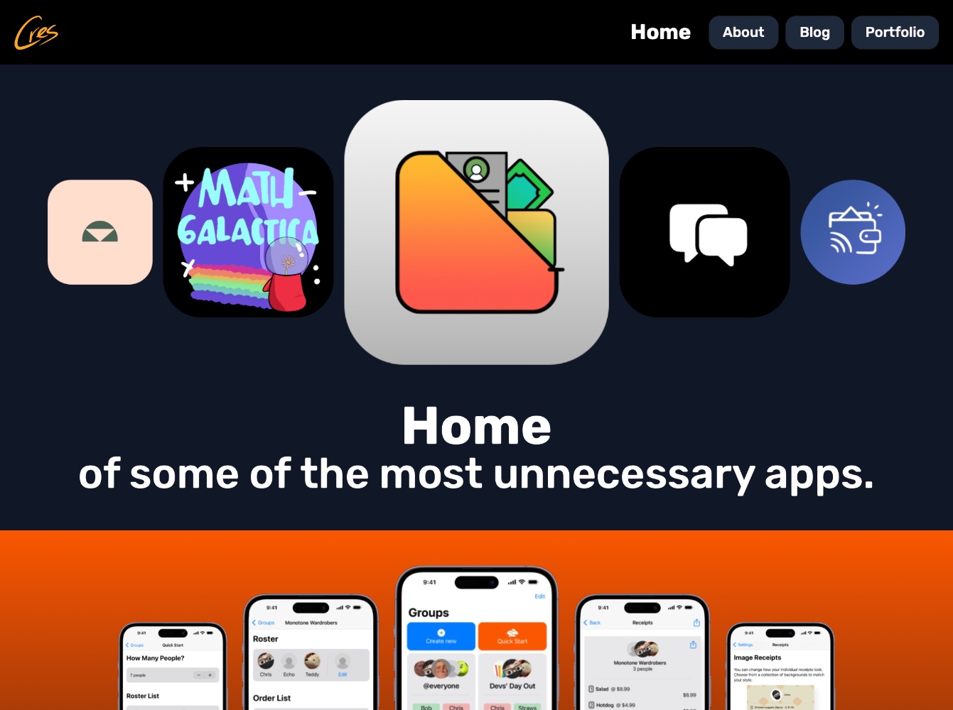
Instead of an (arguably) unnecessary button that allows you to choose a style, why not let your system decide? Your apps probably already do this, and if you wanted a dark interface, you probably already have it on and are in control. UX people don't come for me please.
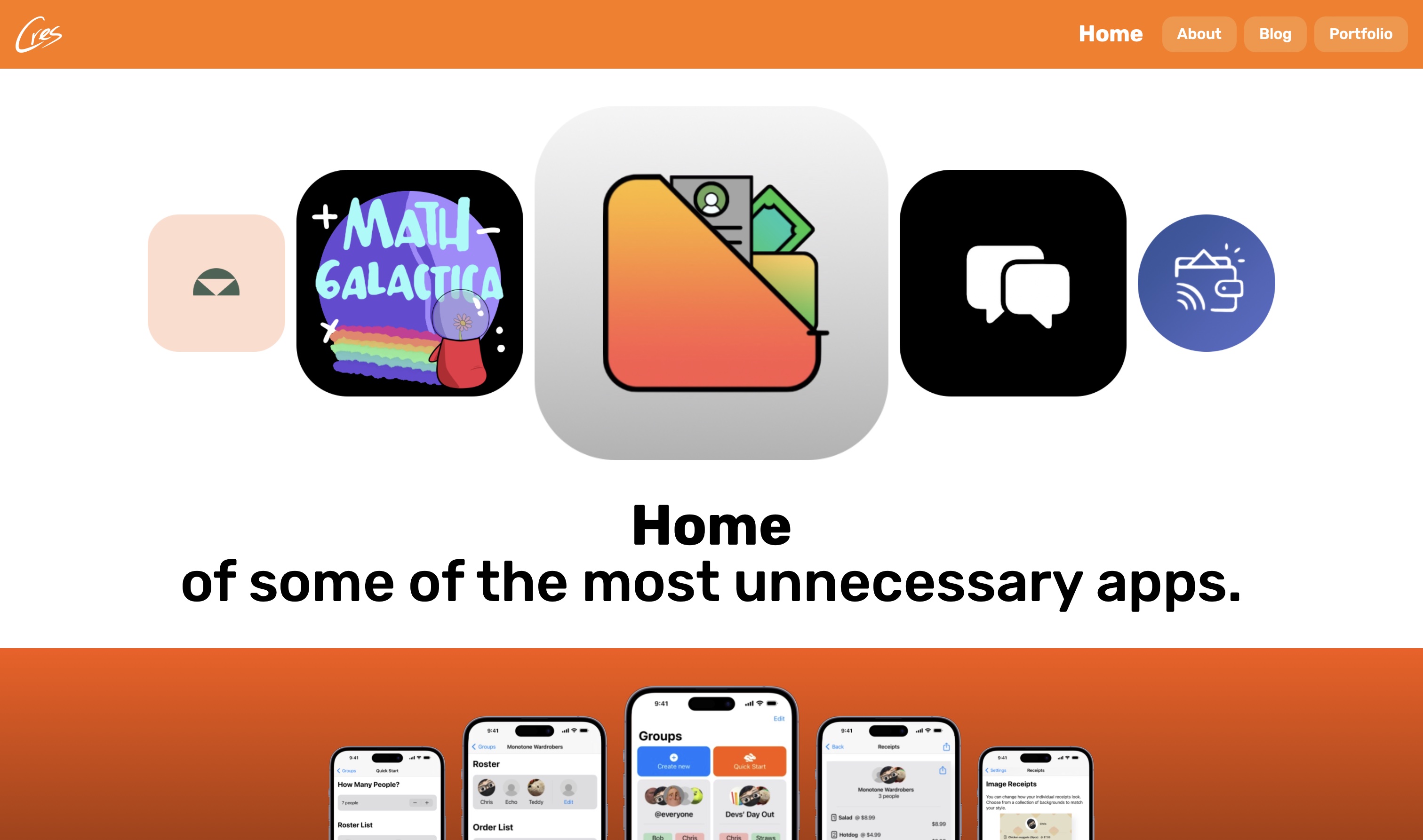
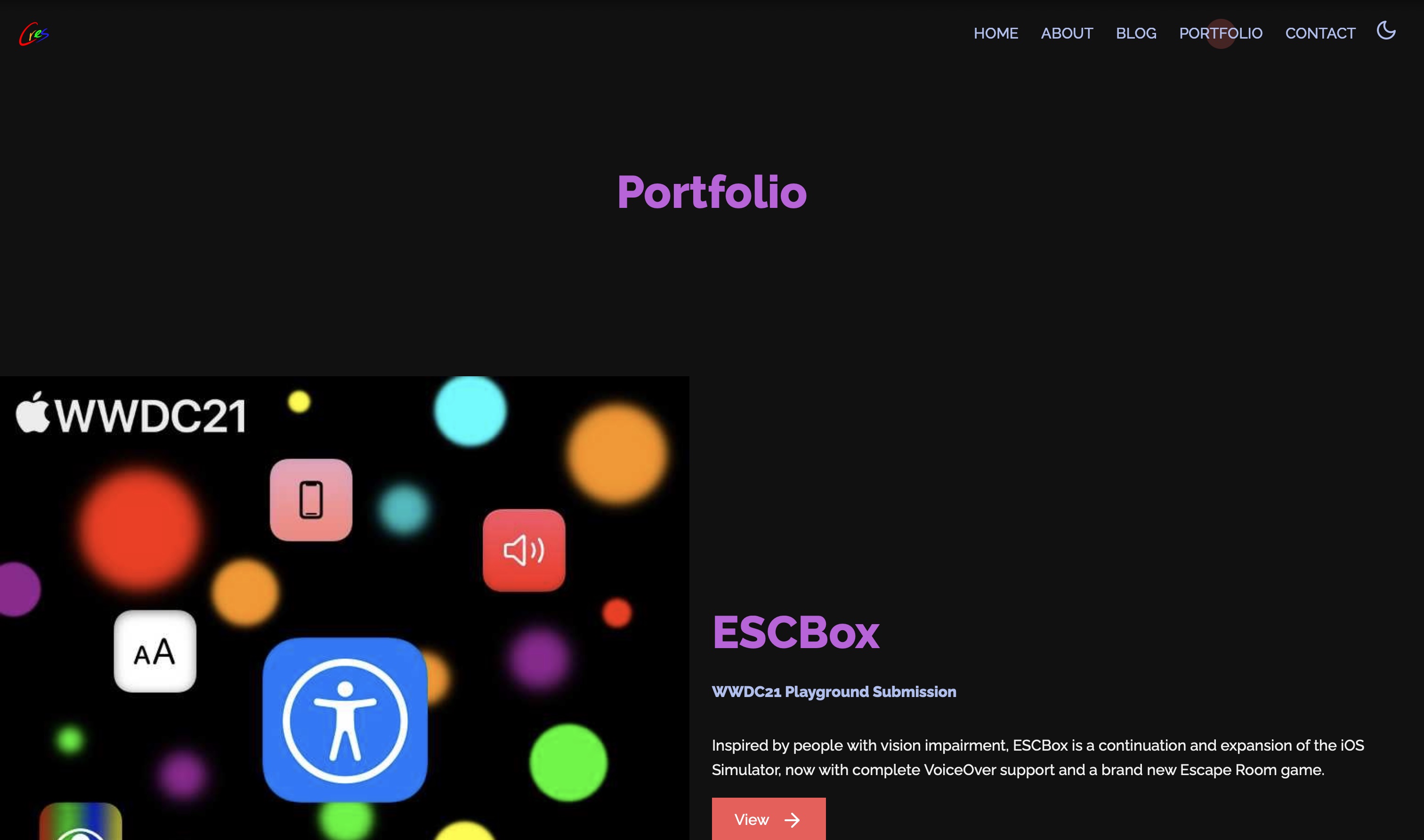
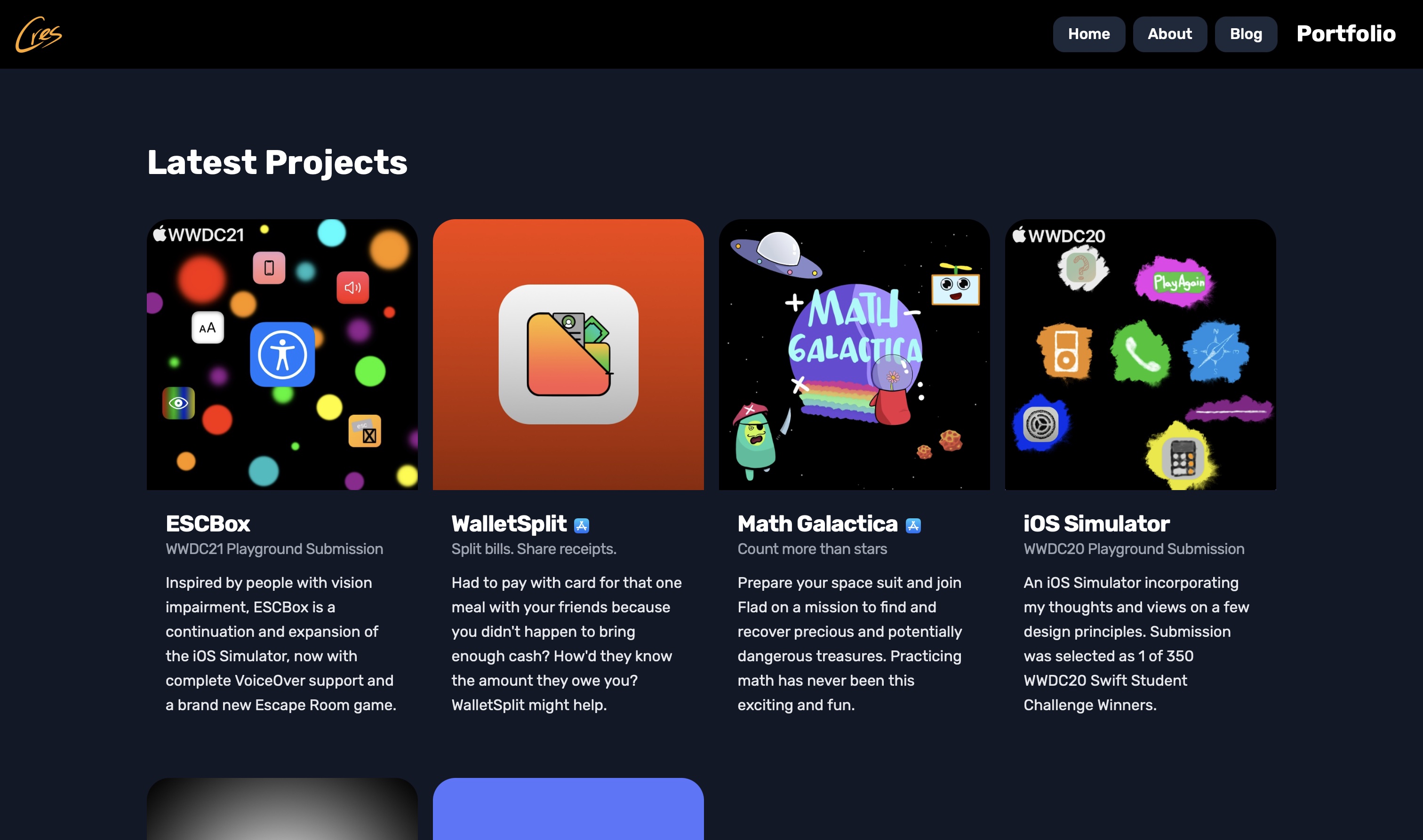
Who wants to continously scroll upon visiting a website? Social media people, obviously, but on a portfolio website? Showcasing things that matter is a good way to filter out unnecessary clutter and failed projects (looking at you, ESCBox), providing a better scrolling experience, if there's anything to scroll through.
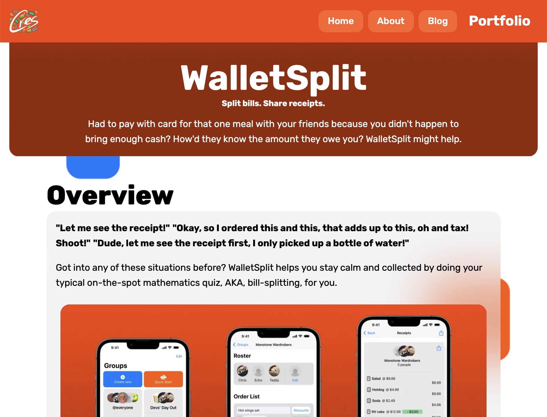
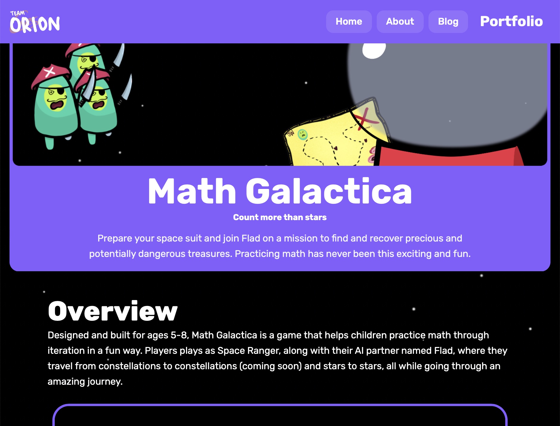
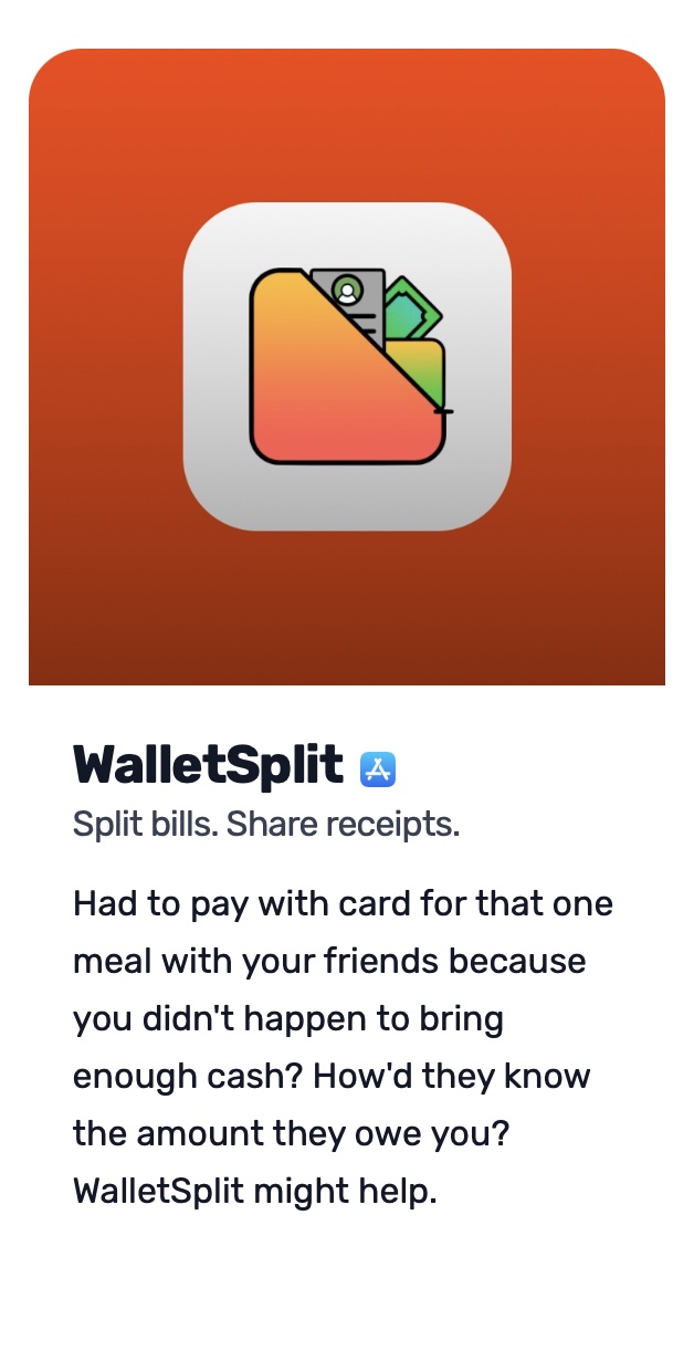
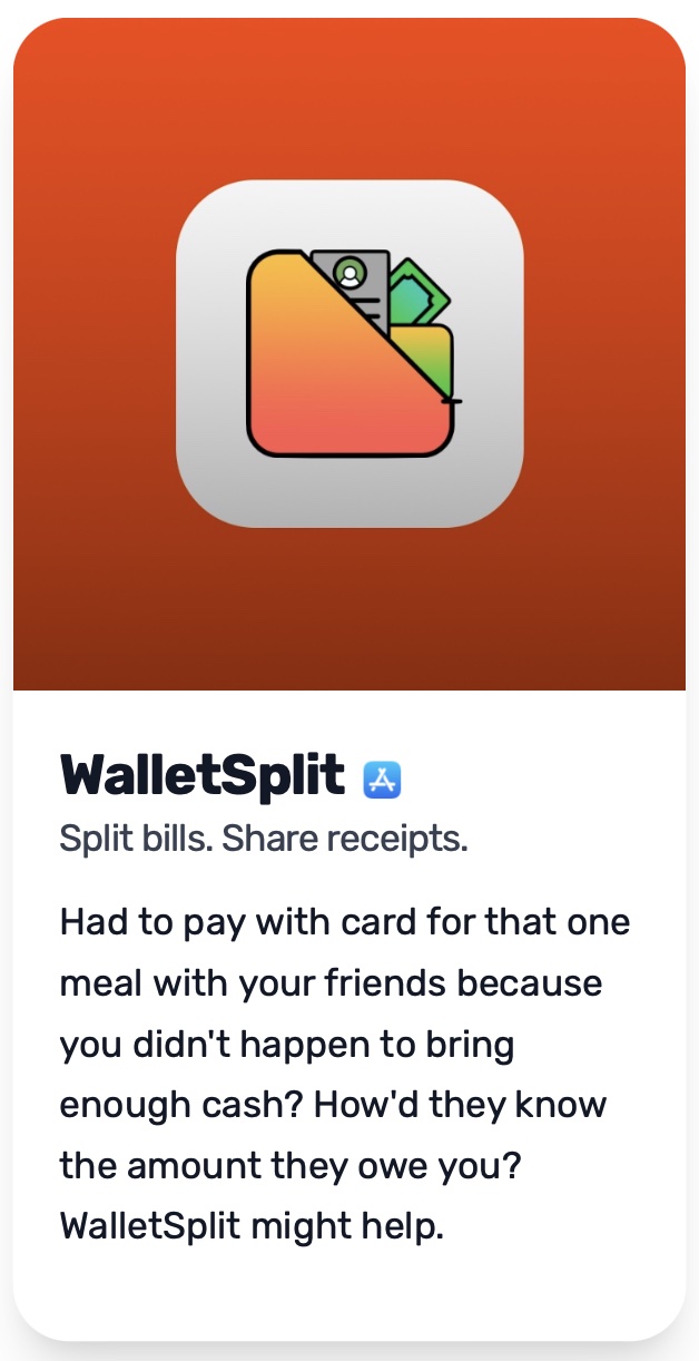
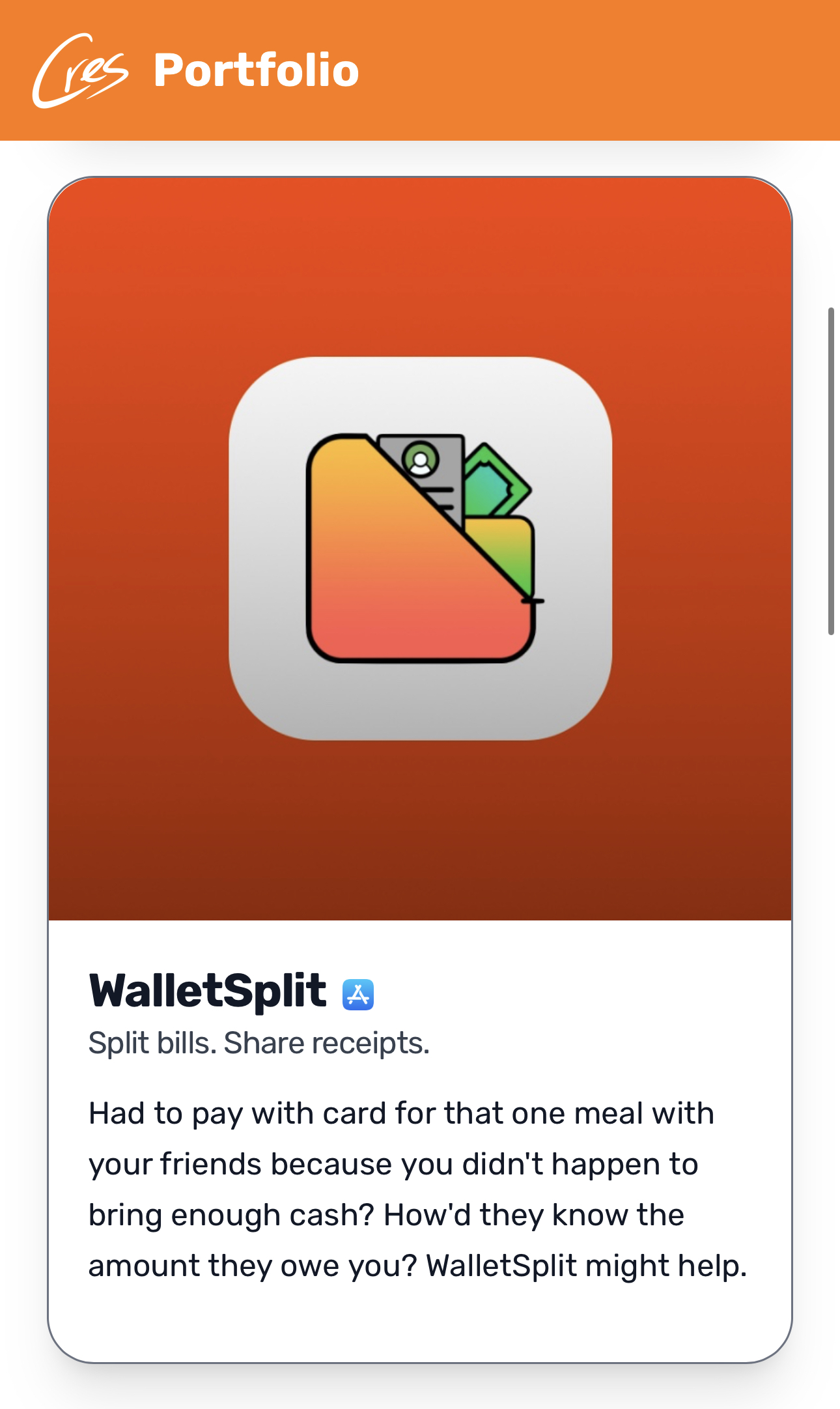
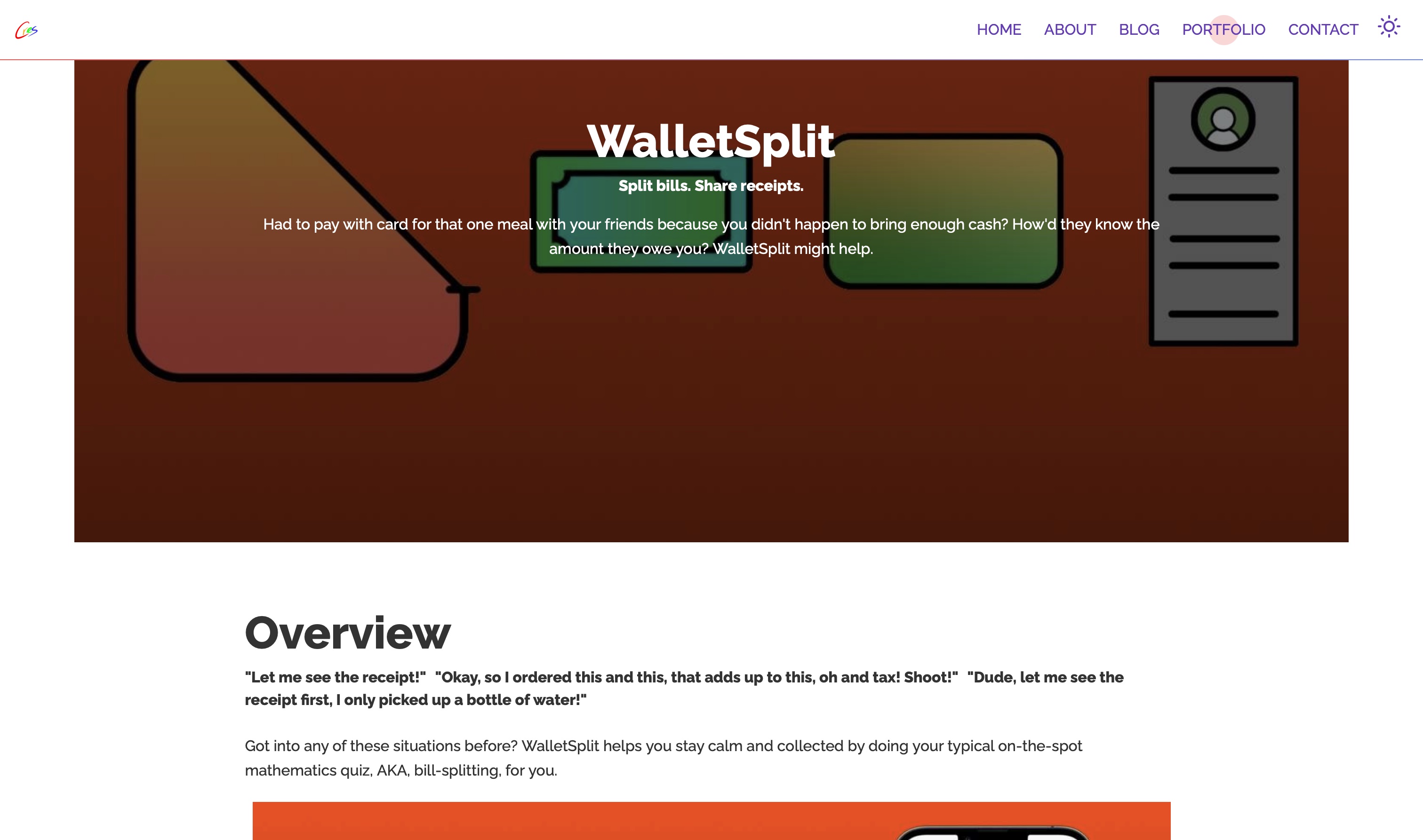
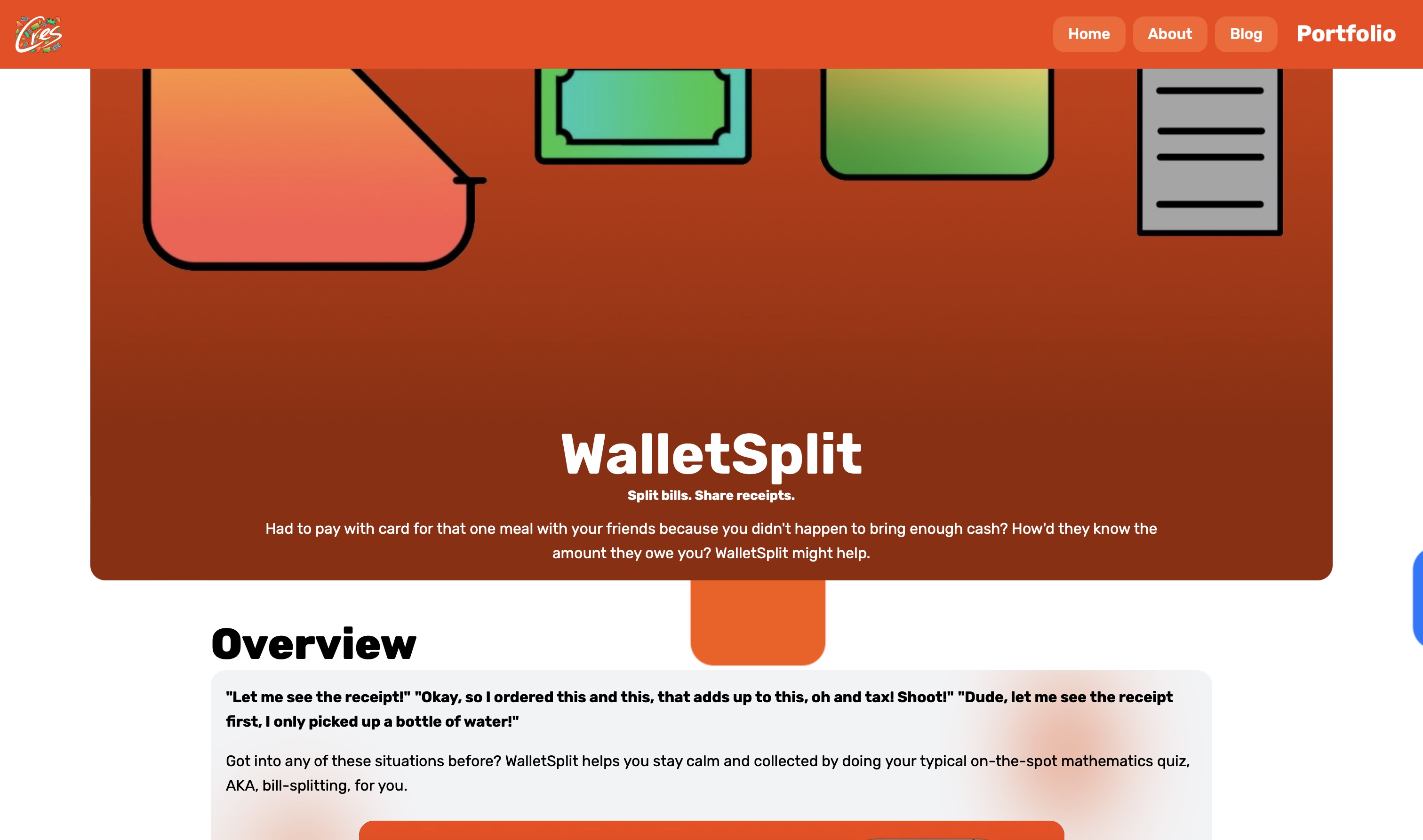
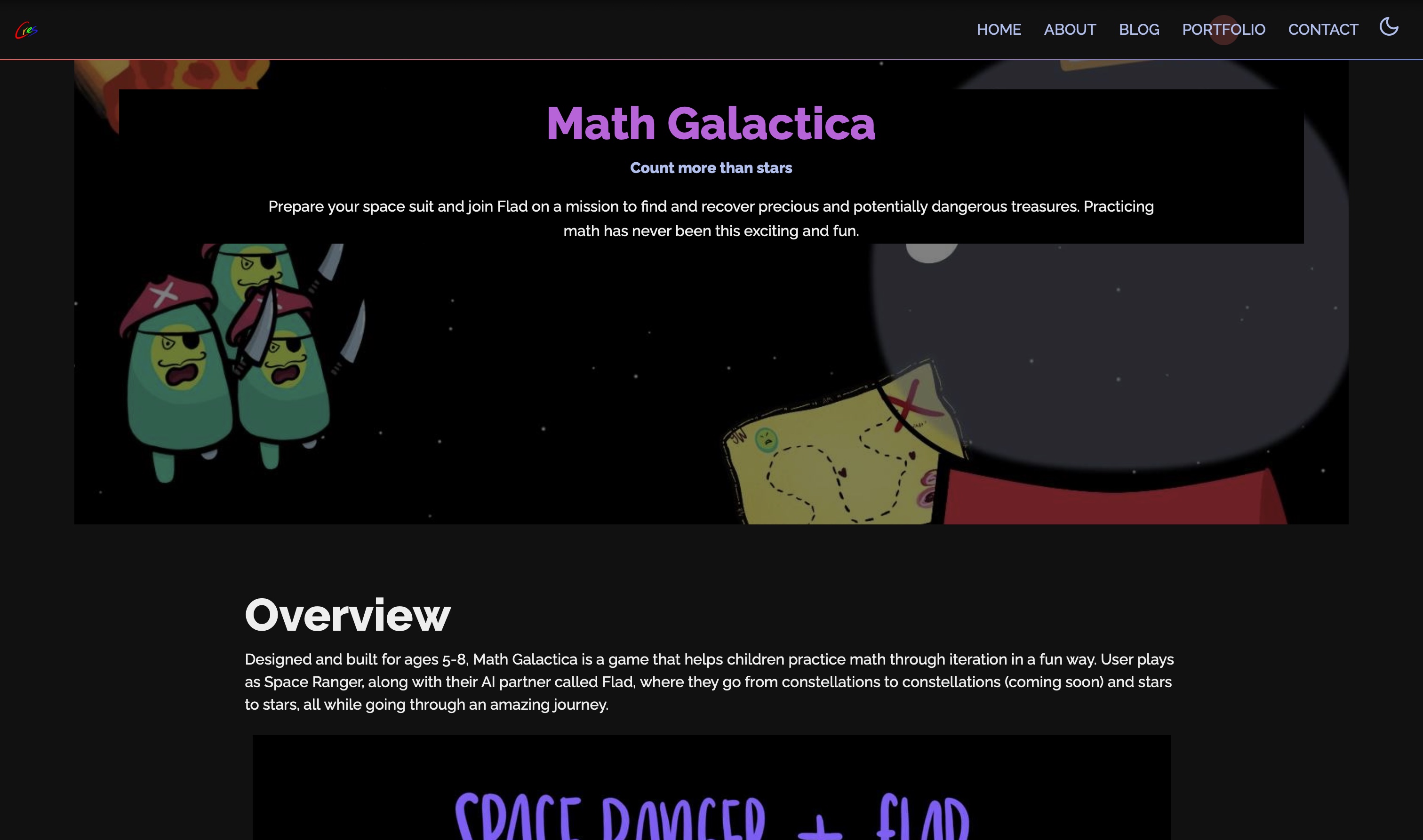
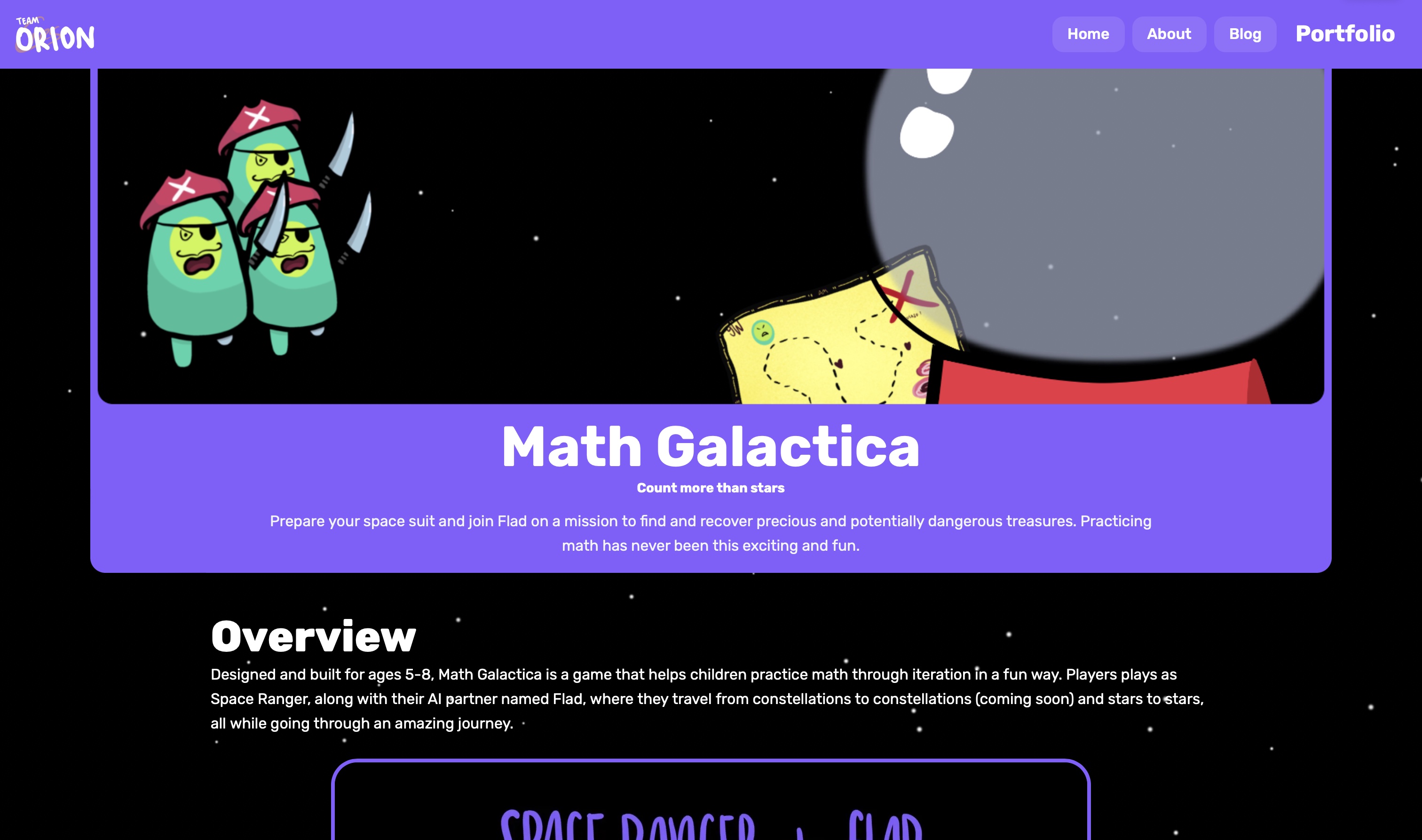
Each and every one of the projects have their own feel and design language. And on commercially available-app pages, it's more of the things that make it unique.
The addition of themed cres logo adds another level of flavor, like salted caramel on vanilla ice cream.


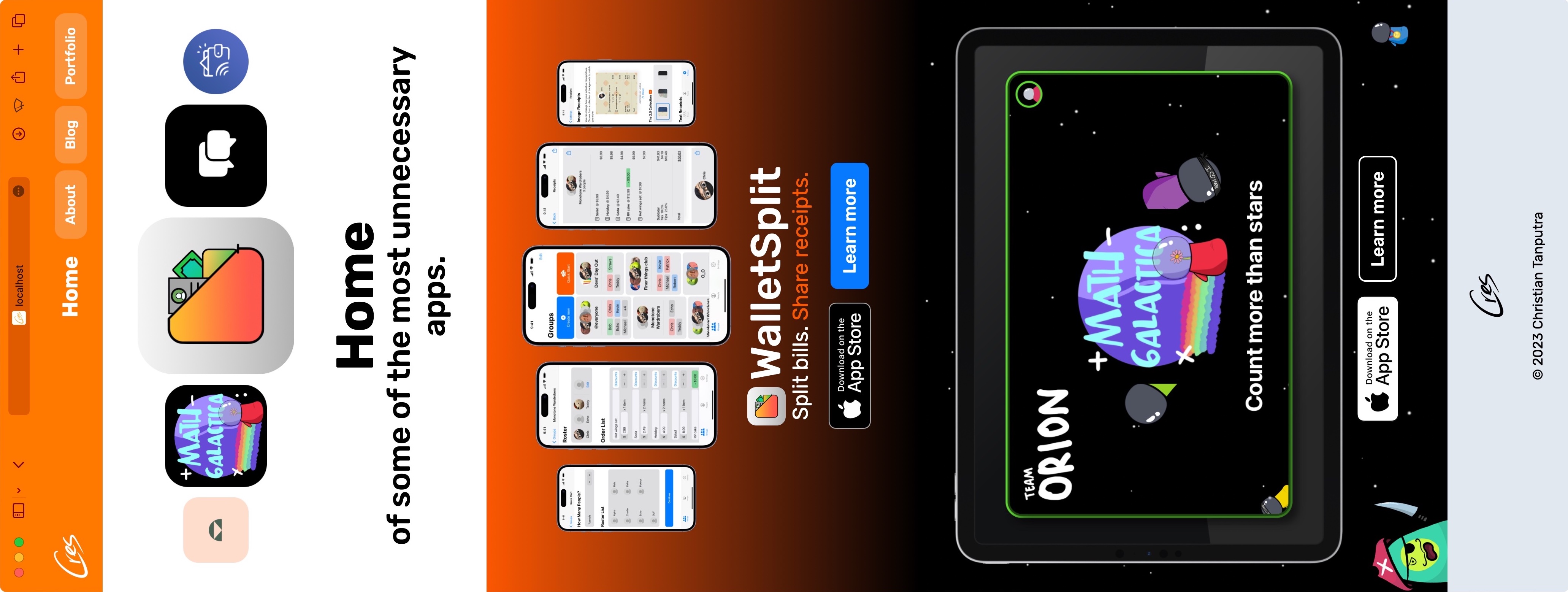
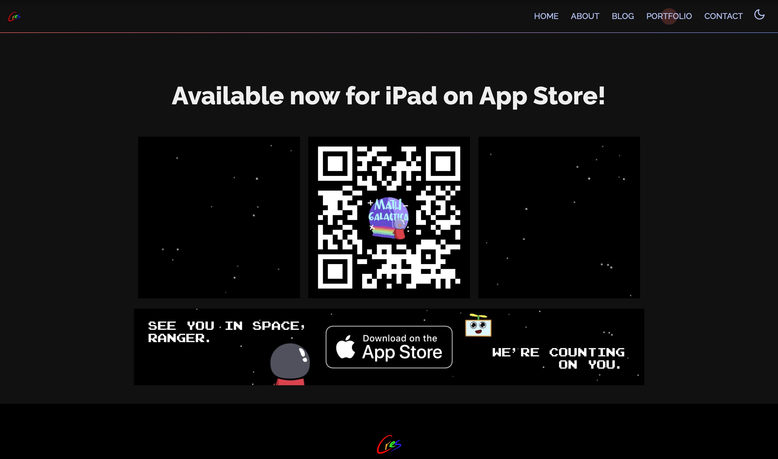
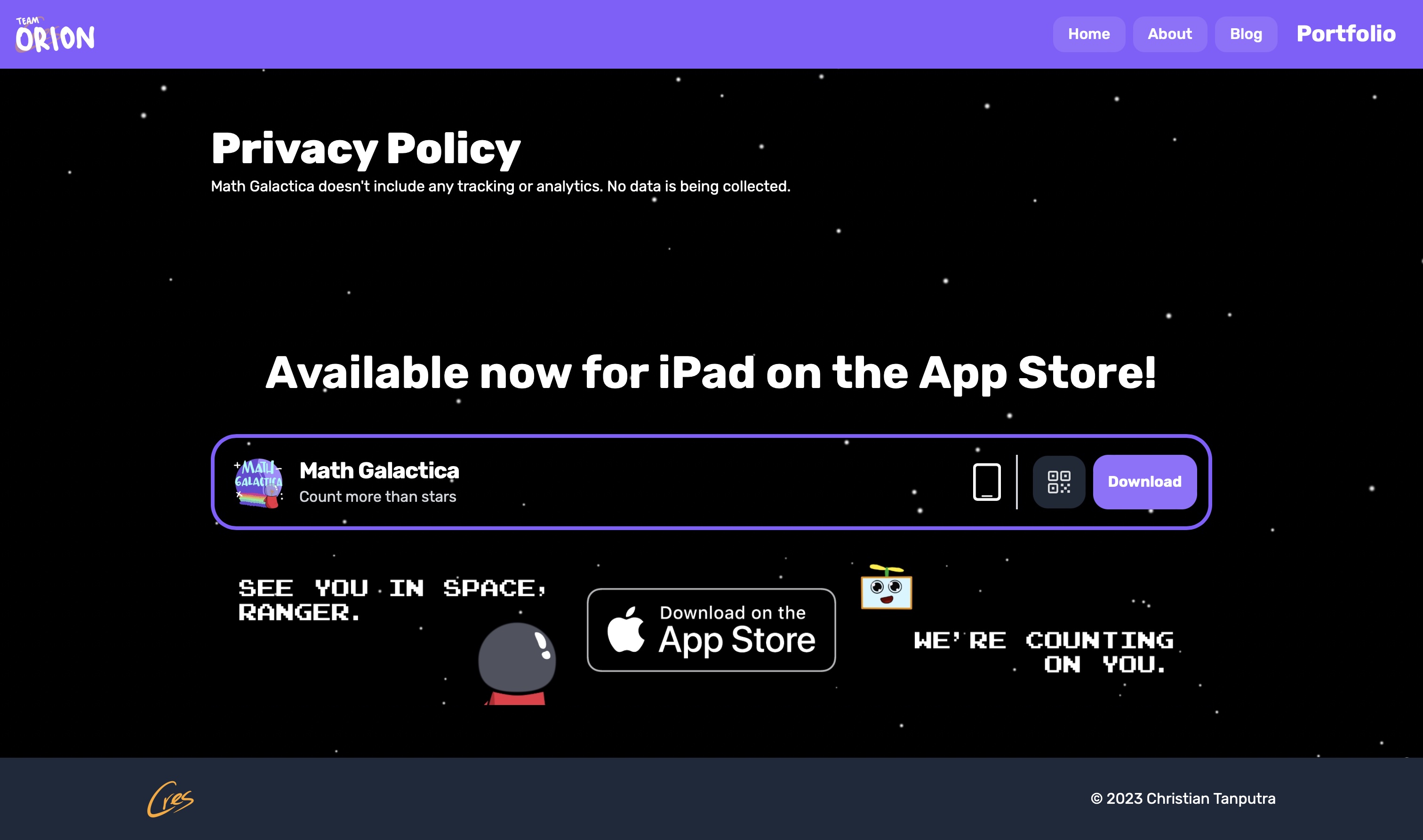
A download bar takes over a window of QR and clickable images, giving quick access to a download link, and a QR code that's only available on a bigger screen, providing easy access to download the app on your phone. Look great on a phone, looks great on not-a-phone.
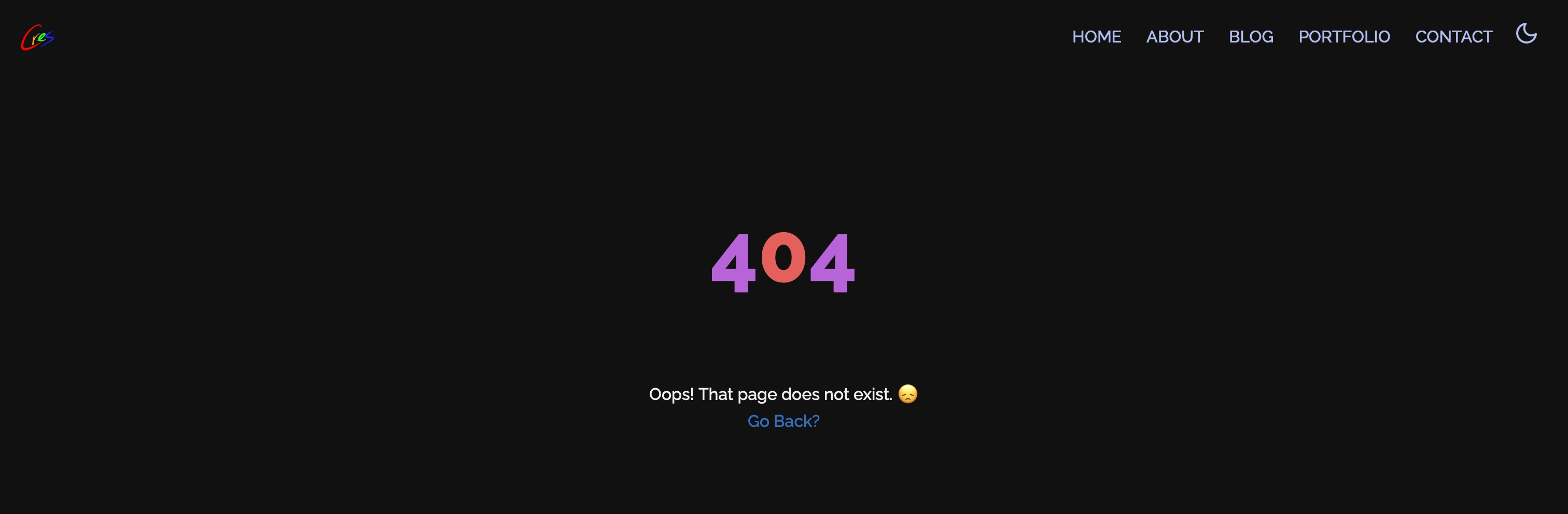
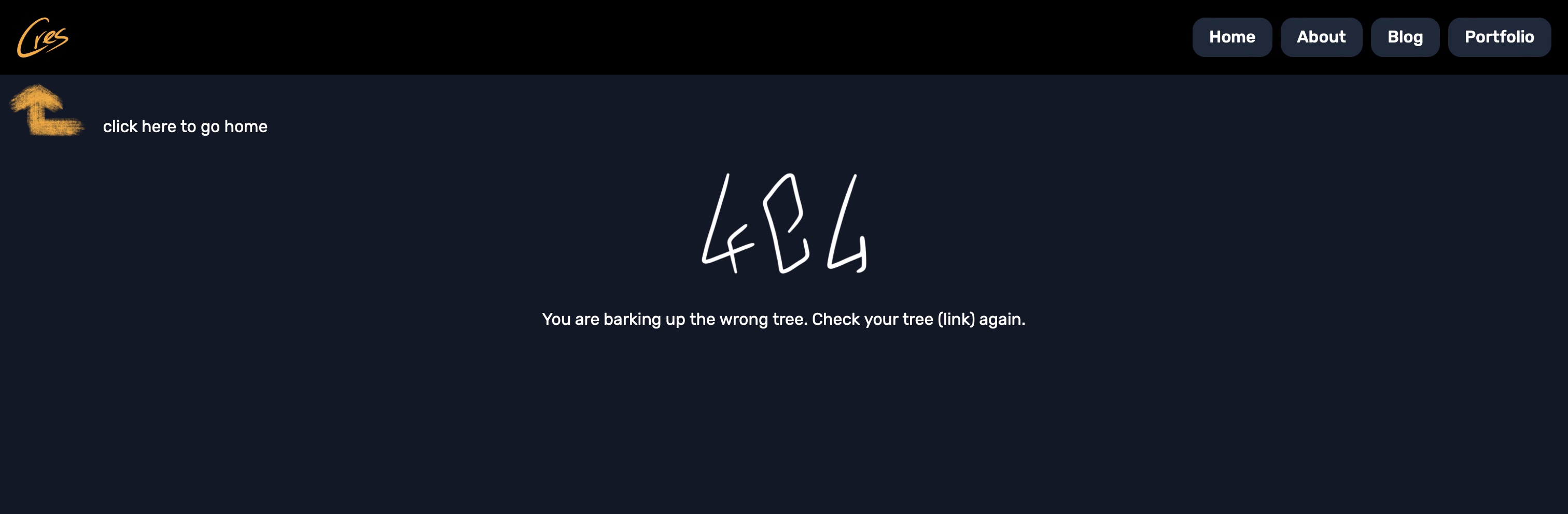
How about some visual comparison between the previous and the new?
While there were a few design choices I didn't get to cover today, I hope you're able to grasp the fundamental way I decide on the UI of this website, and while it might not be perfect (I swear if someone talks about the mobile navbar), you can always hit me up with an email; it's always appreciated.
Journey wasn't easy but it was definitely fun for me. Moving forward, I'll be doing more apps (and potentially games), so look out for this space. And with that said,
Thanks for Reading into this newly RendeRed Repository!

* Compatible browser and JavaScript required. Don't complain about buggy interactions, I don't get paid at all for this. Also, did you know strawberries aren't considered berries, but bananas are?
** What the first * said.